Skip to content
Kimberly Design
  • Home
  • Projects
  • About
  • Contact
Site Search

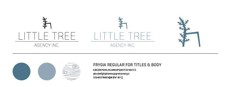
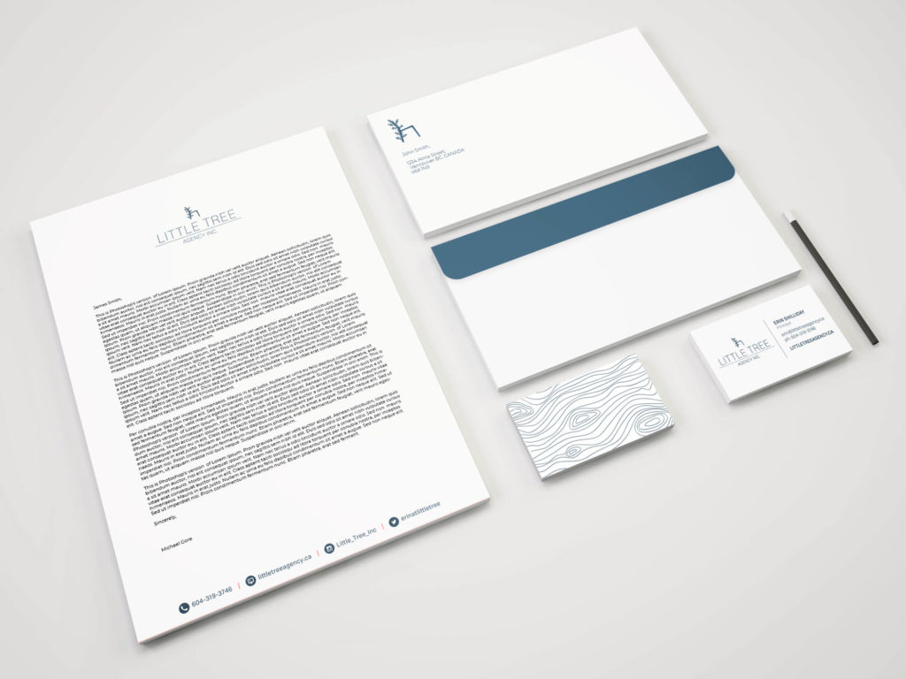
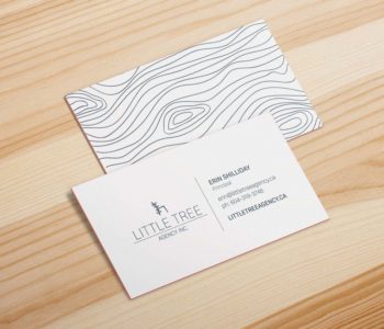
Little Tree Agency Inc

Little Tree is in the contract furniture industry working closely with clients to create functional and inviting spaces. Project House was contacted by the owner to create a brand that was in line with the company’s values with a nod to the west coast where the company was started.

I designed a minimalistic logo and brand identity to keep the design unified and simple. The logo uses a bold silhouette to communicate the functional aesthetic of the brand, while lending itself to the outdoor lifestyle of Vancouver and the target audience of Little Tree. I have also designed the illustrations for holiday cards for the brand.

Pooch n Perks Food Truck Logo Design

Pooch n Perks Food Truck

Pooch n Perks is a food truck company created by two Calgary entrepreneurs catering to both dogs and their humans. The branding for the food truck needed to be eye-catching and bold.

The best approach to get the attention of potential customers was to design a typographic logo from a bold font weight. The sans serif font was modern and rounded to create a feeling of a fresh and friendly identity that matched the company’s vision. A warm dark grey with accents of a electric blue was designed to add contrast and interest.

Pooch n Perks Business Card graphic design

To learn more about these food truck pioneers check out what they’re up to on Facebook!

Registered Nurses Of BC

The Registered Nurses Foundation of BC is a foundation who provides new and established nurses with bursaries to continue moving their careers forward. The RNFBC approached Project House and I with a large scale brand and website refresh.

The logo needed to resonate with the clientele of the RNFBC, and the website needed to handle a large amount of information while still offering a easy to navigate user experience. We began with a creative audit of RNFBC and learned about what kind of message they wanted to send out and the overall design direction we needed to reflect.

In collaboration with the RNFBC and Project House I designed the historically significant nightingale logo, in flight to symbolize forward movement.

As well as helping to mockup certain pages of the website, creating online donation forms, and various marketing materials for the foundation.

Sloth Records Branding Concept

Sloth Records is a local Calgary record store that sells records, Cd’s, posters, tickets to events, turntables and many other music related things. It consists of hard to find local band records and mainly has genres of rock, punk, electronic and metal; so with their slogan “records for the rest of us” they aren’t lying. The new identity for Sloth is to be a reflection of the alternative music that they cater to. Colours in the branding are taken directly from the records they sell, and only black and white photographs with noise will be used because of there grungy feel.

Sloth Records Stationary Concept branding design

Kimberly Burke
I am a talented Graphic Designer with an eye for illustration, brand identity, layout design, and web graphics.

Copyright of Kimberly Burke, 2021.
  • Instagram
  • LinkedIn