Skip to content
Kimberly Design
  • Home
  • Projects
  • About
  • Contact
Site Search

Coast Mental Health

Coast is a Vancouver based non-profit, that provides people living with severe mental illness with the right resources to help them thrive: housing, support services and employment and education opportunities. They needed a template of their annual report that aligned to their new brand identity and was easily customizable for their internal team to work with.

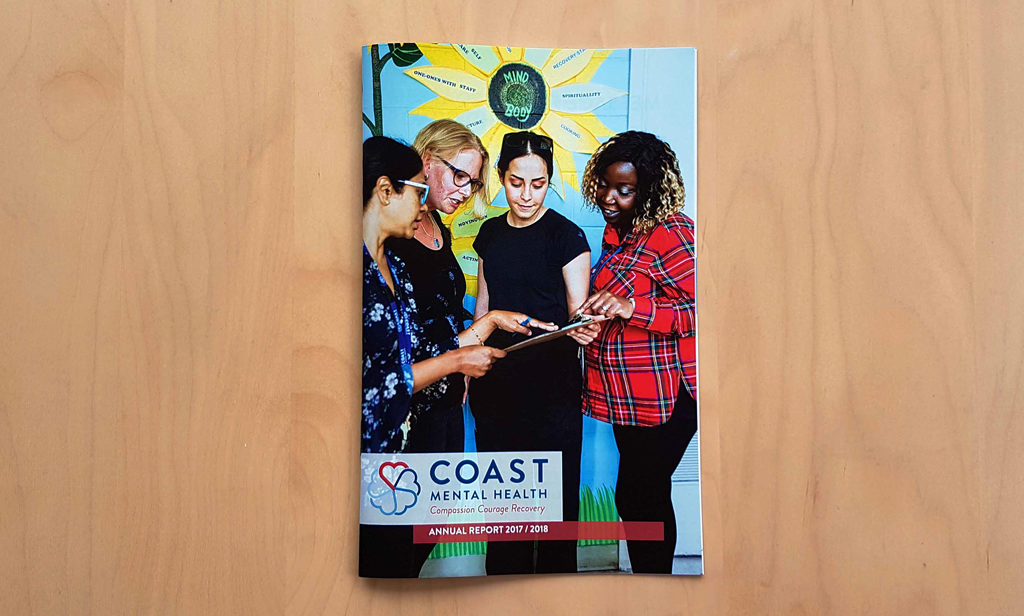
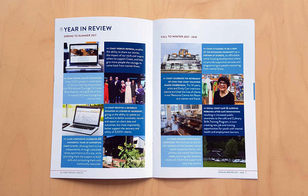
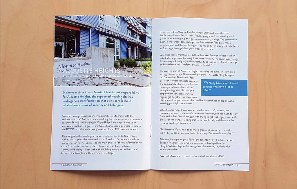
Collaborating with Project House I created templates and designed layouts for both the Foundation and Society’s reports. With thought going into the page, typographic and object styles that are found throughout the design the templates are simple to navigate and use.


Little Tree Agency Inc

Little Tree is in the contract furniture industry working closely with clients to create functional and inviting spaces. Project House was contacted by the owner to create a brand that was in line with the company’s values with a nod to the west coast where the company was started.

I designed a minimalistic logo and brand identity to keep the design unified and simple. The logo uses a bold silhouette to communicate the functional aesthetic of the brand, while lending itself to the outdoor lifestyle of Vancouver and the target audience of Little Tree. I have also designed the illustrations for holiday cards for the brand.

Steadyhand Investment Funds Inc

Project House was approached by Steadyhand Investment Funds asking for design assistance to give a facelift with their current office space. I was tasked with creating custom vinyl of the Steadyhand logo and graphics of the company’s values to place on windows and walls.

Connie Pretula, CNP

Connie Pretula is a Certified Nutritional Practitioner who focuses on a holistic approach to nutrition as well as a health coach to mature corporate women. Connie Pretula needed a brochure for potential clients to inform of the services she provides.

I worked alongside the Project House design team to layout a brochure that was inline with Connie Pretula’s brand. Highlighting the importance of health and nutrition in a visually pleasing matter with the emphasis placed on the beautiful photographs of the food Connie provides to her clients.

Pooch n Perks Food Truck Logo Design

Pooch n Perks Food Truck

Pooch n Perks is a food truck company created by two Calgary entrepreneurs catering to both dogs and their humans. The branding for the food truck needed to be eye-catching and bold.

The best approach to get the attention of potential customers was to design a typographic logo from a bold font weight. The sans serif font was modern and rounded to create a feeling of a fresh and friendly identity that matched the company’s vision. A warm dark grey with accents of a electric blue was designed to add contrast and interest.

Pooch n Perks Business Card graphic design

To learn more about these food truck pioneers check out what they’re up to on Facebook!

Sylvia M. Zaradic

Sylvia Zaradic is a local Vancouver performing artist. With over 25 years working in creative fields such as voice over, theatre, coaching and directing. She needed a website that could showcase her many talents in an organized way. I worked under project house to design personal branding for Sylvia, an easy to navigate site map, web graphics and mockups for the developer to use as a guide while creating the site. Please take a look at sylviazaradic.com

Registered Nurses Of BC

The Registered Nurses Foundation of BC is a foundation who provides new and established nurses with bursaries to continue moving their careers forward. The RNFBC approached Project House and I with a large scale brand and website refresh.

The logo needed to resonate with the clientele of the RNFBC, and the website needed to handle a large amount of information while still offering a easy to navigate user experience. We began with a creative audit of RNFBC and learned about what kind of message they wanted to send out and the overall design direction we needed to reflect.

In collaboration with the RNFBC and Project House I designed the historically significant nightingale logo, in flight to symbolize forward movement.

As well as helping to mockup certain pages of the website, creating online donation forms, and various marketing materials for the foundation.

Diamonds CD Front Cover Design and Illustration

Jim Burke & The Coal Fire Diamonds

From as far back as I can remember, my father Jim Burke has been writing and performing music. It wasn’t until after he had been diagnosed with CLL (Chronic Lymphocytic Leukemia) that he decided to record a CD to create awareness for his music and disease.

The CD had was designed on a 6-panel CD layout and included an eye-catching illustration inspired by the title song “Diamonds” which tells of nothing being more important than the ones you love. Shel Silverstein is one of Jim Burke’s favourite song writers and the illustration pay homage to the drawings included in his many books.

Diamonds CD Front/Back Cover Design and Illustration

Jim Burke’s CD is for sale on Cdbaby.com, 50% of the sale of Diamonds goes towards the Alberta Cancer Foundation and directly to the Tom Baker Cancer Centre for cancer drug research.

Diamonds Inside Cover Design and Illustration

New Age Books & Crystals Mural

The New Age Books & Crystals in Calgary, Alberta was planning to use an area in the shop for talks and meditation, the decision was made to decorate the wall behind with artwork aligning with the store’s beliefs and values.

The bold black and white style of the mural was in line with the New Age Books’ identity. The symbols from spiritualities and religions were designed in a circular pattern to show that they were all equally represented at the New Age.

New Age Rough Draft mural design 01        

New Age Books Mural Design


Sloth Records Branding Concept

Sloth Records is a local Calgary record store that sells records, Cd’s, posters, tickets to events, turntables and many other music related things. It consists of hard to find local band records and mainly has genres of rock, punk, electronic and metal; so with their slogan “records for the rest of us” they aren’t lying. The new identity for Sloth is to be a reflection of the alternative music that they cater to. Colours in the branding are taken directly from the records they sell, and only black and white photographs with noise will be used because of there grungy feel.

Sloth Records Stationary Concept branding design

The Perfect Little Monster Cover Graphic Design

The Perfect Little Monster

The Perfect Little Monster is a story of a young monster that is not afraid to be who she is teaches parents and their children alike that it is alright to be different because that’s how to change the world.

The design for the illustrations in the book were inspired by the classic Dr. Seuss drawings which consist of black ink outlines and minimal accents of  colour throughout, as a nod to the children stories that the parents’ generation grew up with.

Kimberly Burke
I am a talented Graphic Designer with an eye for illustration, brand identity, layout design, and web graphics.

Copyright of Kimberly Burke, 2021.
  • Instagram
  • LinkedIn